◇◆
Navigation
A Tag Library provides HTML documentation for this Tag Set. You can click on links
to travel from one topic to another and use your browser’s “Back” button to backtrack
through previously-visited pages. In addition, there are two navigation aids on every
page:
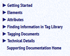
- To the left is a colored vertical Navigation Bar (Navbar) with links to all parts of the Tag Library.
- At the very bottom of each page, in the far right corner is a “Back to Top” link.
One-button Collapsing/Expanding
Hiding the Navbar:
- To stop displaying the Navbar, click the left-pointing arrow at the top right of the
Navbar.
(
 )
)
- To restore the Navbar, click the right-pointing arrow at the top left of the Navbar.
(
 )
)
Close Sections in Navbar:
- To collapse all sections displayed in the Navbar back to the top-level hierarchy,
click the “squiggly arrow” at the top right of the Navbar. (
 )
)
Expanding/Collapsing Pages: Tag Library pages with content that can collapse and expand will include two diamonds
near the top right of the page, which permit a user to expand or collapse the entire
page rather than expanding/collapsing individual sections.
- To expand all closed sections, click the hollow diamond (
 ).
).
- To collapse sections back to the starting configuration, click the solid diamond (
 ).
).
Printing the Pages: Note that if the page is printed, only the content that is currently visible (expanded
sections) will be printed. The content of collapsed sections does not appear when
the page is printed.
Search Bar
If your system supports it, a small search bar will appear at the top left of the
tag library display.
 (Click the “?” for
hints on using the search bar.)

Enter a word or phrase to search for it in the Tag Library headings. Use <tag-name> to search
for elements, @attribute-name to search for attributes, and %pe-name to search for parameter
entities.

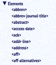
 ) appears next to the
section’s title.
 ) and
opens a list of sub-topics within that section.

